





UniFi UW
One surface for campus life.
- Role
- Product Designer
- Timeline
- Oct – Dec 2025, 10 weeks
- Team
- 5 designers
- I owned
- Research synthesisInformation architectureHi-fi + testing
Overview
The problem wasn't any one tool. It was the seams between all of them.
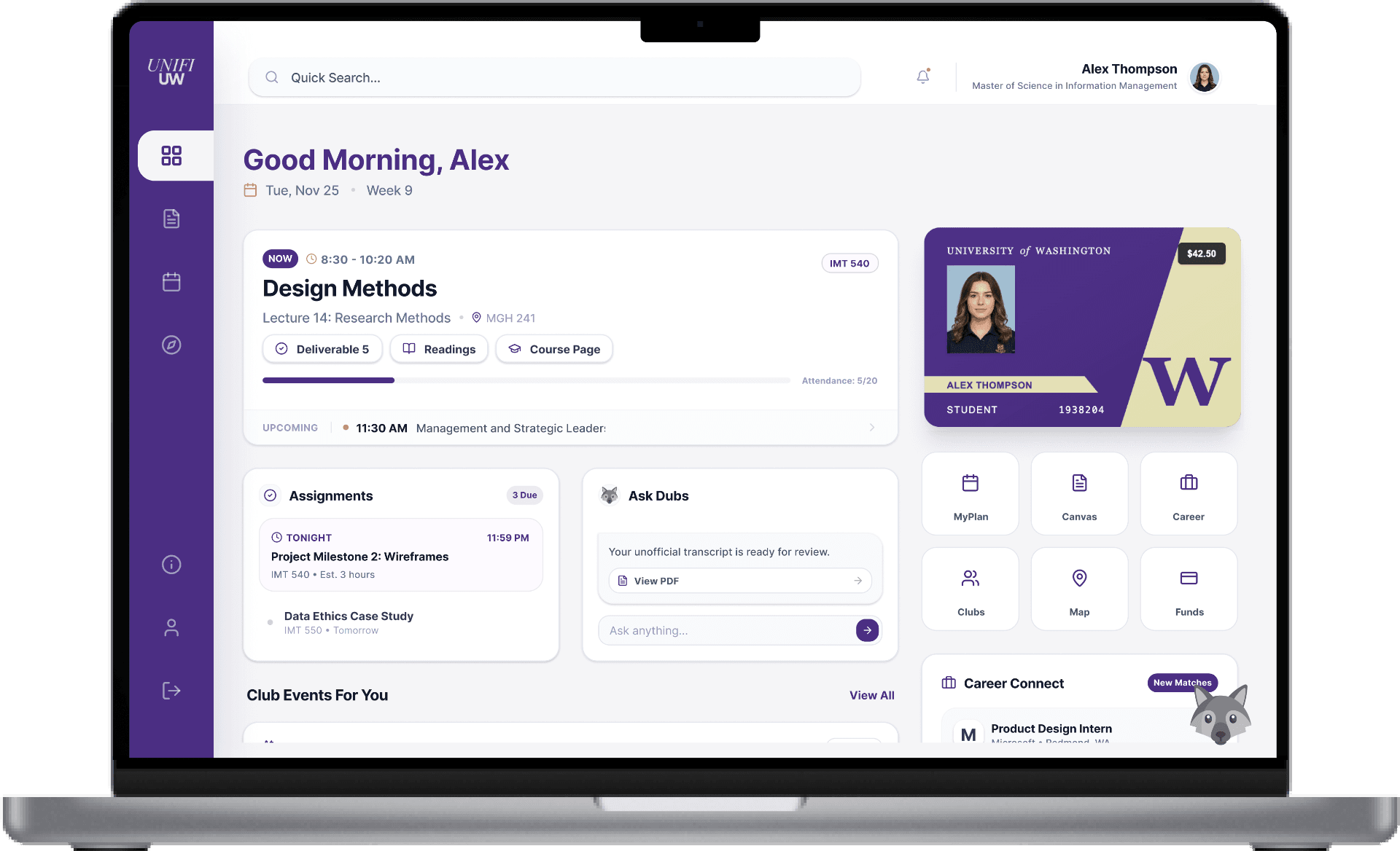
UW students reconstruct campus life by hand across a dozen disconnected platforms. On a team of five designers, I owned the research synthesis and information architecture and led the hi-fi design and usability testing behind UniFi, a single surface that brings academics, organizations, and campus life together.
What follows is the product first, then the thinking that got it there.
Onboarding
A quiz that tailors the home before you arrive.
Decision
Onboarding is skippable. Personalization is worth a lot, but not at the cost of a slow first run, so the quiz tunes what surfaces first and never blocks the student from getting in.
Ask Dubs
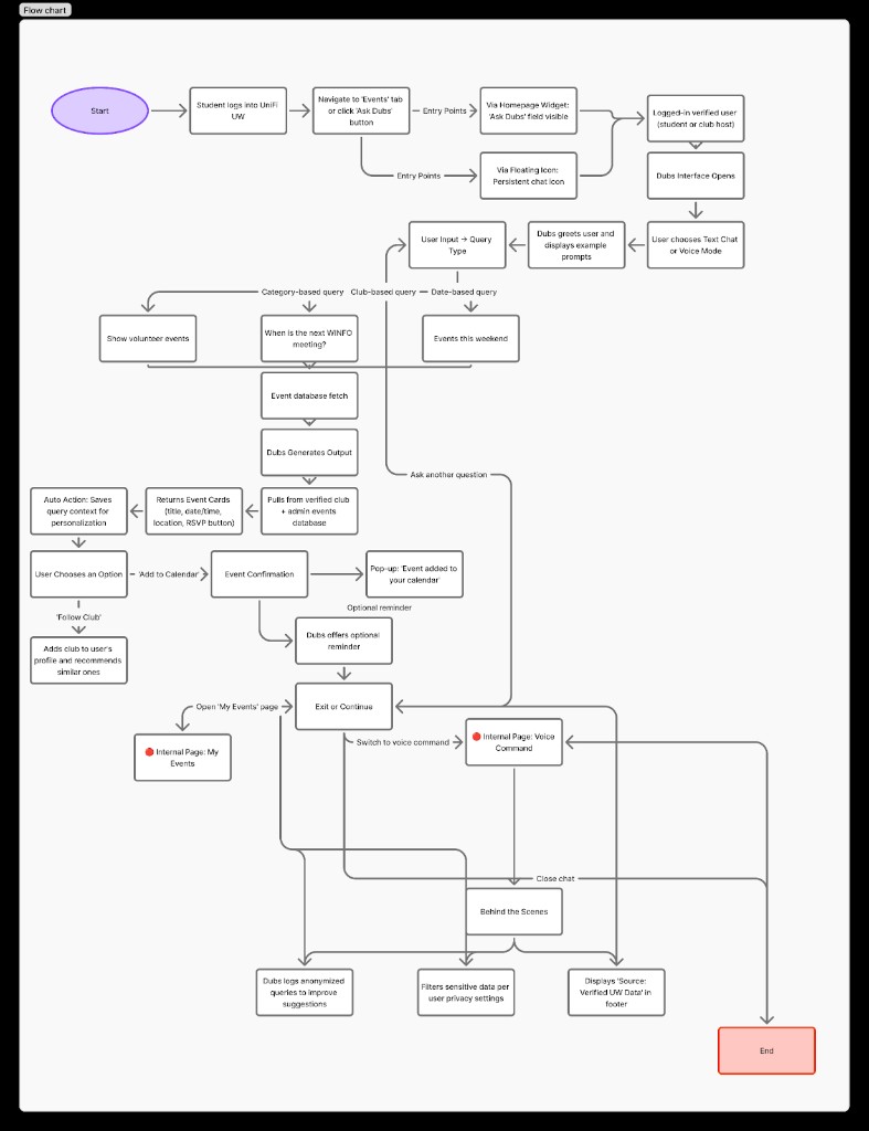
Natural questions. Answers you can act on.
Decision
Dubs returns cards, not chat. A chatbot that only talks adds a step; surfacing events, clubs, and deadlines as objects a student can RSVP to or save keeps the answer actionable.
Solution
From fourteen channels to one intentional surface.
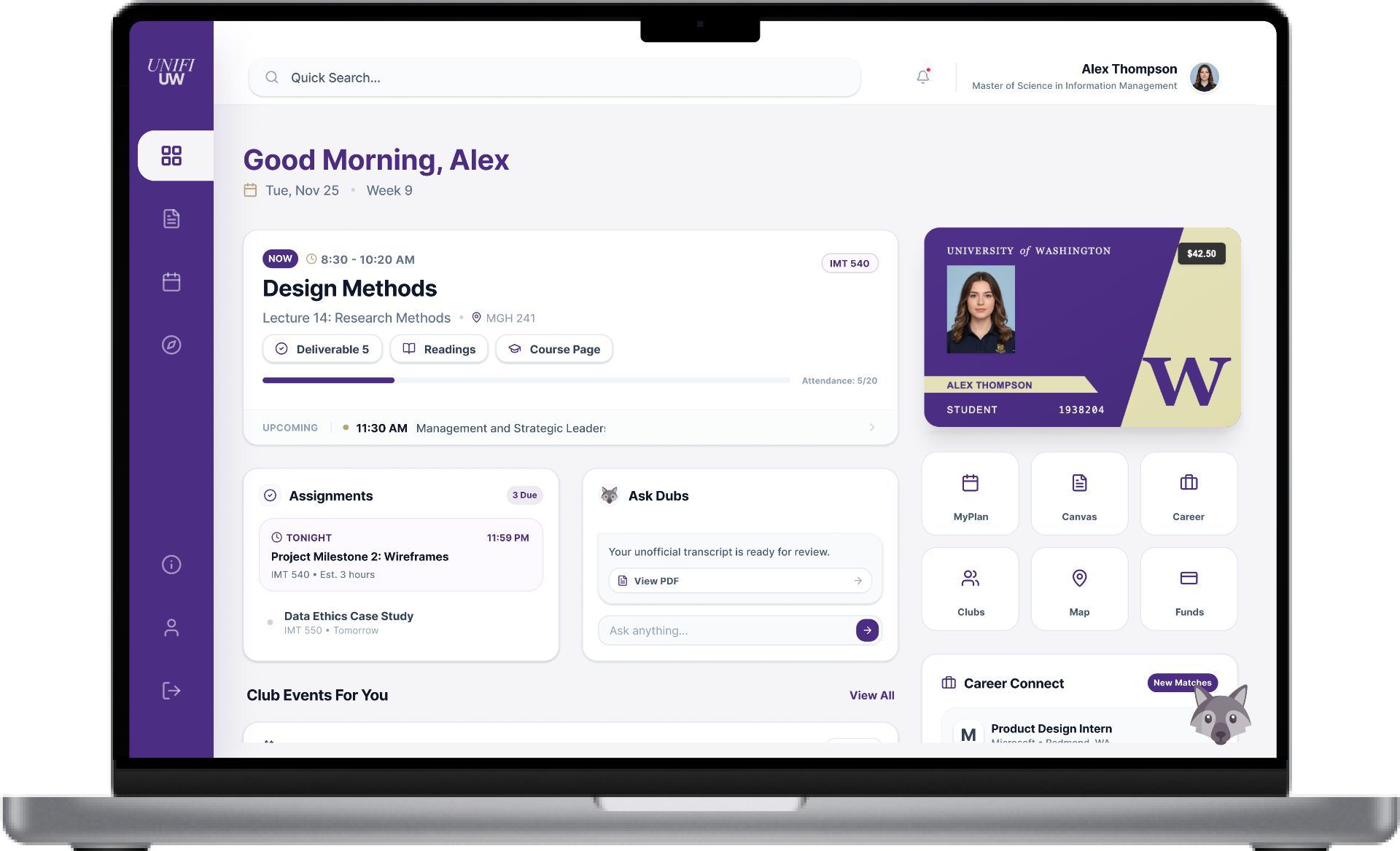
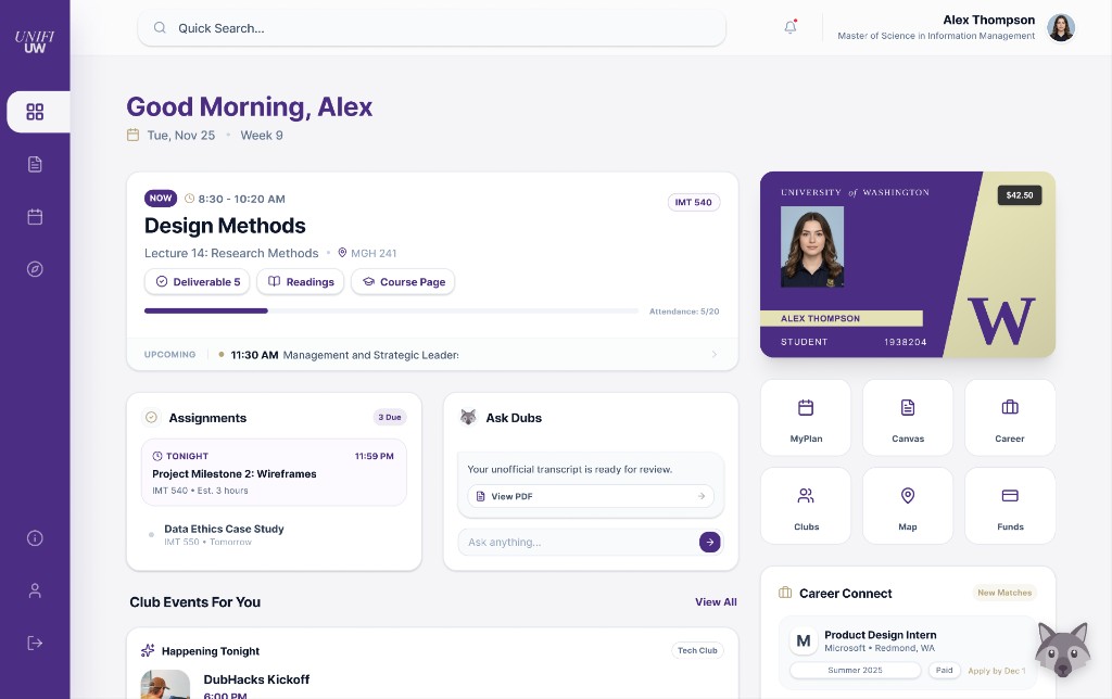
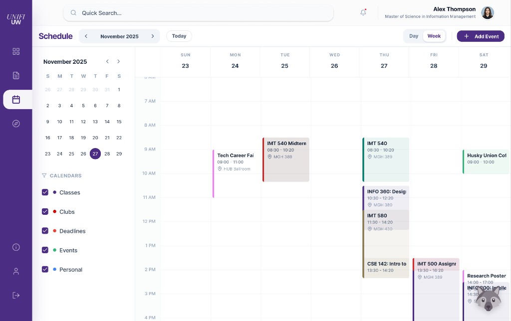
Three views carry the product: a dashboard that answers “what needs me today,” a schedule that unifies academics and events, and a discover surface for everything else.
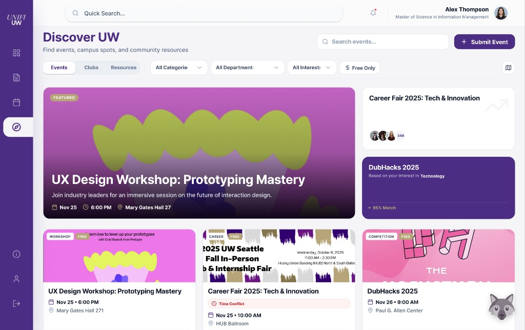
Decision
Consolidate without flattening. Everything lives in one place, but the dashboard ruthlessly prioritizes what is time-sensitive so a unified surface never becomes a new firehose.
The Problem
Fourteen platforms, zero coordination.
To get through one week, a student checks email for deadlines, Canvas for assignments, HuskyLink for clubs, MyUW for academics, and Instagram for events, none of which talk to each other. The cost is cognitive, and it lands hardest on students who are new, commuting, or already overloaded.
Student survey · n = 23
Research
We validated the problem before designing.
A 23-person survey and five task-based cognitive walkthroughs, run before any visual design. My job was to turn the raw responses into decisions the team could design against.
From the survey
How would you describe finding events or opportunities that match your interest?
I feel overwhelmed by the number of notifications I get from the University.
How do students learn about clubs, events, or opportunities?
How do students find out about administrative reminders?
What we heard, and what it decided
We heard
Students reconstruct a single week by hand, across email, Canvas, HuskyLink, and Instagram.
So we designed
One home surface that pulls academics, orgs, and deadlines together, so nothing has to be hunted for.
We heard
UW-affiliated tools felt outdated, so students defaulted to outside apps.
So we designed
A calm, modern interface students would actually choose over the alternatives.
We heard
RSVP links and calendar integration were the most-valued features by a wide margin.
So we designed
Actionable event cards and one unified calendar, treated as core, not add-ons.
The Question
How might we help students see what matters, without the noise?
Every screen was measured against this one question. It held three tensions in balance: consolidate without flattening, notify without overwhelming, and keep students in control of what surfaces.
Information Architecture
Flows and priority, before pixels.
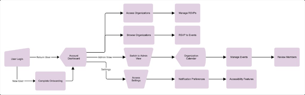
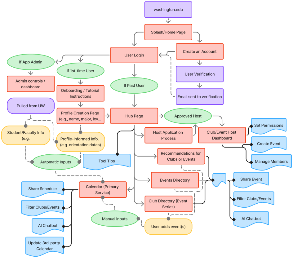
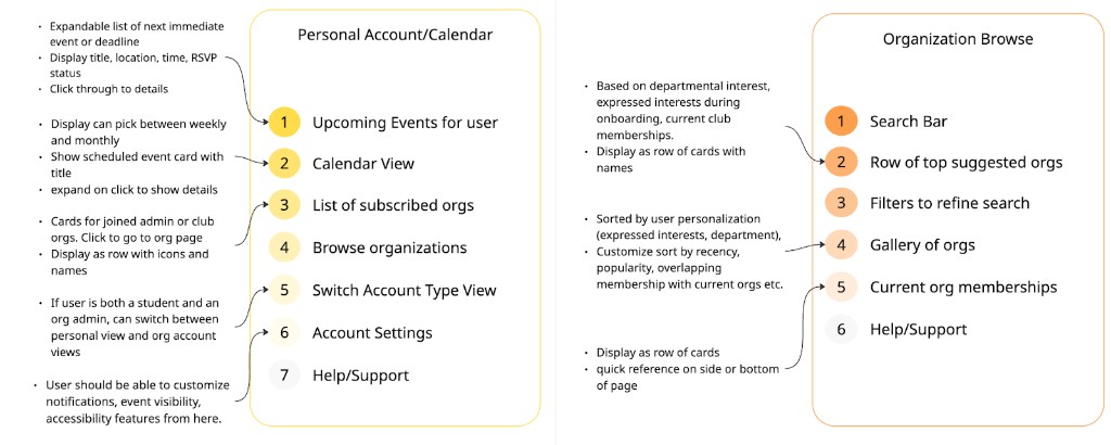
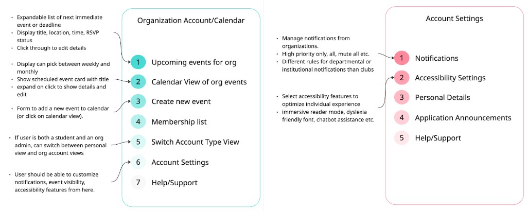
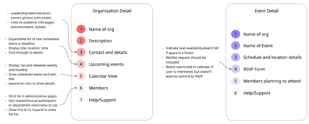
I mapped the full IA, the personal and organization flows, and content-priority maps before any visual design began, so hierarchy was an argument we settled early rather than a styling decision made late.
User flows
Content priority
What Testing Found
The honest read from usability testing.
Task-based think-aloud sessions across the early prototype. Two areas held up; two revealed real problems I would take into the next iteration.
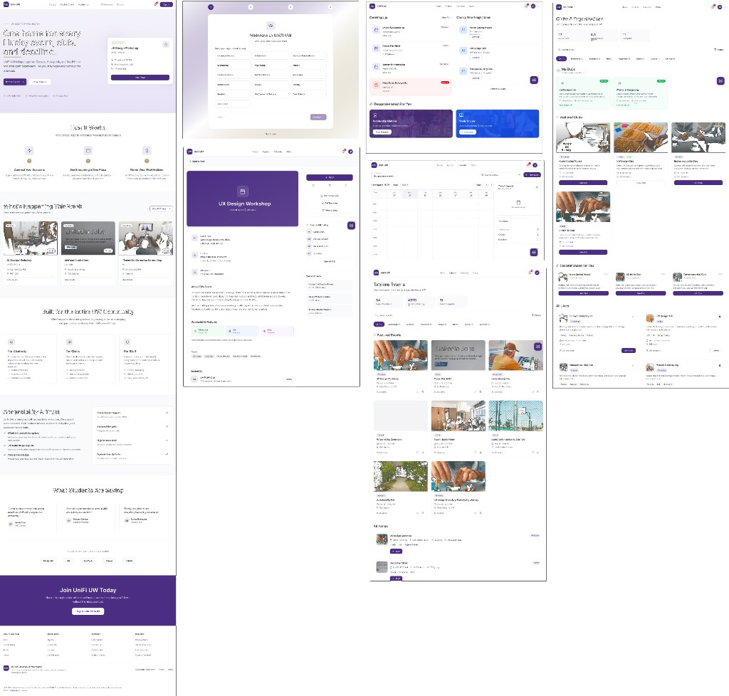
Account creation
Minimal friction, quick completion, familiar sign-in placement.
Ask Dubs
Hard to locate, and answers felt thin without direct links to act on.
Event & club discovery
“Events This Week” and Explore competed; users expected a clearer sign-up step at RSVP.
Calendar
Easy to read and consolidate, with lingering confusion between personal and suggested events.
Outcome
Testing confirmed the core bet: pulling academic, campus, and organizational information into one place measurably cut the work of navigating campus. The clearest insight was that the value wasn't in the intelligence of the system, it was in how well it structured a fragmented experience.
Where I'd take it next
Resolve the Dubs discoverability and linking issues that testing surfaced
Disambiguate discovery: merge or clearly separate “This Week” and Explore
Accessibility pass on contrast and low-vision guidance before any pilot
Reflection
Designing UniFi taught me that reducing friction beats adding intelligence. The best systems don't automate everything, they help people reason about what matters, and that clarity starts with understanding how people are struggling before you ever sketch a solution.